 |  |
 |  |

Wednesday, December 28, 2011
Prints Now Available!
Now you can get prints of some of what I consider my most successful pieces. Each one is $7.00, printed on heavy weight, photo quality paper and are suitable for framing. For a limited time, I'm throwing in free shipping flat in a rigid envelope to help thwart malicious mailman upset at Postal Service budget cuts and taking it out on you.
Sunday, December 18, 2011
Buy my artwork on Etsy
I've started to add drawings to my Etsy shop in an effort to make it available to as broad an audience as possible. You can go over there and buy original drawings I've done and posted here, at Sketch Charlotte or Big Dog Studio.
Here is a sampling of what I've got available on Etsy.


Here is a sampling of what I've got available on Etsy.
Sunday, December 11, 2011
I'll Draw Anything For You!
(Note: This post is an exact copy of the Commissions page. I'm copying it here, because I seriously want to supplement my income.)
Want some original art?
Got a character that you love?
Need a unique gift for someone?
I'll do commissioned drawings. These will not be sketches, but fully rendered drawings, detail depending on the subject you request. All drawings will be on 8 1/2" x 11" card stock, making them easy to find a frame for. Depending on the subject matter, the medium will be charcoal or ink. Either way, you'll have a nice darkly rendered drawing to show off. The price for a drawing is $25, as long as you're not asking for more than three people in it.
I'll also do 5" x 8 1/2" for $10, with the same level of detail as the larger drawings.
I hear you asking, how will this work?
First off, e-mail me at carpaltunnelpress@gmail.com, letting me know what you want. If you want a likeness of someone, send me a photo. I draw comics, but for you, I'll draw just about anything. When I'm done, I'll e-mail you a watermarked scan of your drawing, at a resolution of 72 dpi.
Here are some samples:


How do you get money to me? I prefer PayPal, but you can mail me a check, if you want. Once I have the money, I'll mail you your drawing in a plastic sleeve and inside a reinforced envelope, clearly marked "DO NOT BEND." If you have trouble with your mailman bending your large mail to fit, consider having it sent to a work address.
12/12/2011

The two ladies in the first panel are the same ones from before, that hit on Jenny's boyfriend. As for the waitress, you have to wait to find out.
Friday, November 25, 2011
Do You Like T-Shirts?
 On Deviant Art, this is my most popular drawing. What most people don't realize is that it's available as a t-shirt through Printfection, which does some great quality tees. I have one that I wear from time to time, and almost without fail, I get a conversation with someone that likes it. at Printfection, you can get it in any color you want, but I prefer it in Red. As the shirt ages, the color adds to the aging feel of the image. In red and the other dark colors, they sell for $23.99. In lighter colors, you can get them for as cheap as $18.99
 I also have a Jet-Pack Jenny t-shirt available and because of the image, I only offer it in white, which means it's just $18.99. It's also available in ladies and kids sizes, a ringer tee, and a totebag!
Sunday, November 20, 2011
11/21/2011

Tom is in the midst of his depression and goes somewhere that will remind him of his wife. That last part was an addition, and not in the original draft for this strip. Tom originally was going to go to a bar and just drink, but I wanted it to be someplace seedier. Making an appearance in the strip is Sketch Charlotte member Henry Eudy who just happened to be sitting across from me as I was drawing the panel. The fact that the dancer resembles Starfire is a comment on how she's being portrayed lately in the New DC 52.
Hopefully the next strip will be a little timelier, but with the holiday, I won't promise next week.
Friday, November 11, 2011
Apparently we're back to the 90's at DC
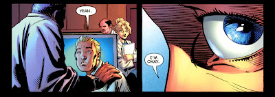
It didn't take four months until we saw the worst art cliche of the 1990s show up again in a DC Comic. In Batgirl #3, I could complain about the giant moon that while incredibly large was entirely inaccurate or the complete ignorance of Physics that lets Batgirl ignore inertia and swing into a subway car going around a sharp curve. The problem I have is with the use of an extreme closeup of the eye.

Let me say this again, it doesn't add to the drama to go right into someone's eye. The eye doesn't look that different when you're shocked except in its relation to the rest of the face. The face conveys so much emotion, that getting closer on one eye actually takes away from the drama of a scene. In this case, reflecting Nightwing's costume motif dds nothing since the entire last half of the book is Batgirl interacting with Nightwing. This is horrible, and absolutely bad art, and I'm hoping that they get a better artist on this book, especially if you're going to use Adam Hughes on the covers.
Let me say this again, it doesn't add to the drama to go right into someone's eye. The eye doesn't look that different when you're shocked except in its relation to the rest of the face. The face conveys so much emotion, that getting closer on one eye actually takes away from the drama of a scene. In this case, reflecting Nightwing's costume motif dds nothing since the entire last half of the book is Batgirl interacting with Nightwing. This is horrible, and absolutely bad art, and I'm hoping that they get a better artist on this book, especially if you're going to use Adam Hughes on the covers.
Sunday, November 6, 2011
What Comics Are Capable Of, Part Three
Apparently, all the criticism is getting to Tom Batuik. This is just too meta.

Saturday, November 5, 2011
Anyone want a jet-pack?
 About ten years ago, I built a jet-pack as a life-sized model of the jet-pack that Jet-Pack Jenny wears. From day one, people went nuts for it. It's followed me through numerous moves, from convention to convention, and now the time has come to let it go. You can own my jet-pack by purchasing it on eBay.
Sunday, October 23, 2011
10/24/2011

Batgirl
 A couple of weeks ago at Sketch Charlotte, I drew this Batgirl in my way big sketchbook as I've come to call it. I really don't like the new Bat-Family costumes as they're just a little too busy, with a lot of extraneous details that seem to be there for no reason other than look more realistic.
Sunday, October 2, 2011
A couple of diversions
Okay, so I buy myself this new sketchbook that's really big, probably the biggest I've ever owned. It barely fits in the backpack that I take to Sketch Charlotte. The freedom it grants is that I can not worry about running out of room and then blowing up the sketch on my copier just to piece it together on the lightbox. That's precisely what I had to do with my last Jet-Pack Jenny drawing and more recently, my Wizard of Oz drawing, which will be done as soon as I can get to my lightbox again.
On the topic of Jet-Pack Jenny, I started this drawing at last week's Sketch Charlotte meeting after yet another disastrous start on a Power Girl drawing. I liked it and finished it up over the weekend. I believe it's in the running for the cover of the collected Power of 01.

The second drawing was inked at Sketch Charlotte, but started while I was sitting at HickoryCon last month. The character is planned to be part of my next story Hanamori's Circus. I do believe that I'll be curbing my need to throw a lot of ink down on this one.

Thursday, September 15, 2011
Art Book now on sale!
 My art book is ready!
It started off as a "sketchbook" at 20 pages but quickly ballooned to 36 before I knew it. I was inclined to put a lot of color pieces in it so to make it a little more special, I went to making it square-bound with a dust cover added. The print quality is excellent, with my artwork being reproduced better than I could possibly hope. Each piece is also accompanied by commentary explaining the process behind it. There's also a sketchbook section with some selections from my sketchbooks that never quite made it to a finished state. There's also a great introduction by a good friend from Sketch Charlotte, Brandon Padgett. The art book is $10.00 through PayPal, and I'll even throw in free shipping! As stock is replenished, there may be some delays in shipping, but I'm going to try to always keep a few in stock.
Friday, September 9, 2011
Coloring in Progress
 Putting together the art book (which will be made available in the store sometime in the next week) made me rediscover my love of coloring. The last time I tried coloring Jet-Pack Jenny and the Factor of 01 made me feel really lackluster at the thought of coloring this story. I had a couple of hours this morning before the wife woke up, so I started coloring one of the strips that I'm happier with, and I'm really liking the product so far.
What do you think?
Wednesday, August 31, 2011
We're Back To Extreme Closeups of the Eye
I read Flashpoint #5 today and if there was any doubt that the DC relaunch is a return of the 1990s, it gets lessened by the discovery of the worst artistic trend of the decade, the extreme closeup of the eye.
I touched on this before, and it's a shot that's useless and usually used to elicit drama, but only when the artist doesn't realize that just pulling the camera back a little to show the expression of the face could convey the drama so much more. That being said, let's take a look at the following cuts from near the end of Flashpoint.
 For a technique that's used to convey drama, this shot choice is really weak. Consider that this is the last panel on the page, and it is essentially a guy asking Barry Allen if he's all right. Ooo, drama.
I touched on this before, and it's a shot that's useless and usually used to elicit drama, but only when the artist doesn't realize that just pulling the camera back a little to show the expression of the face could convey the drama so much more. That being said, let's take a look at the following cuts from near the end of Flashpoint.

Thursday, August 25, 2011
Redrawing Jet-Pack Jenny

I have a gallery show coming up in January (not April as I once mistakenly wrote elsewhere) up in my old stomping grounds of Lenoir, NC and I wanted some strips that were better suited to the gallery environment. Eventually, I am gonna re-draw an earlier Jet-Pack Jenny story that I’m not happy with, and decided that this shot needed to be expanded to full strip length. It’s Jet-Pack Jenny tossing Bad Bette over her in a judo-type flip.
I look forward to redrawing this fight. I feel I'm a much better artist than when I first did this story years ago, but don't look forward to it anytime right away. I have three or four strips left in Factor of 01, then I'm going to concentrate on a story that we're tenatively calling Hanamori's Circus. Any time spent away from that will be collecting Factor of 01.
Sunday, August 21, 2011
08/22/2011

These last strips focus more on Tom coming home to his entire life destroyed. His son is dead, his wife has gone missing and a fugitive from the law. Life pretty much sucks, even though you've just been cleared of a serious crime.
Sunday, August 7, 2011
08/08/2011

Now it's time to talk about what comes after this story ends. I'm going to be working with a nice young creator named Pan D'Attac (yes, it's a pseudonym) on a story divorced from the 23rd century, all while I put together a collected Factor of 01. I'm not putting together a timetable yet, since I don't know yet how long this will take. In September, The Art of Stan Ford will be available in the store for purchase, or in person if you find me at a Sketch Charlotte meeting.
Tuesday, June 21, 2011
Goodbye, Examiner.
The time has come for me to admit once again that a little side project of mine has to go. Since January, I have been writing about comics in Charlotte for examiner.com. It was fun, and I got to be useful to several great artists, but not as useful as I would have liked.
There was about a month where my first examiner article was in limbo and getting someone to approve it was impossible. When Google news stopped considering examiner.com articles news, my hits dropped off by 50-75%, which meant getting paid at all would be hard to do. Payment depended upon hits to my articles, and quite frankly, not enough people were visiting to make up for the time it took to write articles, much less code them for links. I had some damn fine articles, too, which essentially went unread. Even when examiner highlighted my articles, the traffic increase was negligible, which really made me question examiner's value.
Add to that the restrictions put upon me by examiner. Articles could not be too long, articles needed to have local interest, I could not write in the first person. When the review team ruled that an article on HeroesCon wasn't local and my category editor wouldn't get back to me despite me contacting him directly, the writing was on the wall for me. This seems very familiar to me that I really want to do comics, but I need to have that time and with this distraction, I can't get it done. I'm also just not enjoying it anymore. It's become a chore, and to have made the equivalent of $1.00 and hour to do this, it's just not fun enough for a hobby anymore. I've been enjoying blogging about the DC Relaunch, and I look forward to uploading a new Jet-Pack Jenny comic soon.
Wednesday, June 15, 2011
First Thoughts on the DC Relaunch: Part Four
Okay, this is gonna be the last one of these, just because I need to back to drawing Jet-Pack Jenny
 Catwoman #1 - Hey remember those Catwoman comics that were delightfully dark capturing the character's nocturnal nature and how well she blended in with the night skyline? Yeah, I hated that, too... (smell the sarcasm there?) The solicitation looks to keep the general sense of the character, but I would expect nothing less of Judd Winick except to not go anywhere different or challenging with the character, and what I loved about the last Catwoman series, besides the Adam Hughes covers, was that the character was put into situations that challenged her and helped to evolve her character. I've not seen Judd Winick do that for any character since Kyle Rayner, and even then, the challenges were trite, and in the infamous "girlfriend in the refrigerator" scene, downright offensive. Seriously, if there's anything by Judd Winick that's genuinely good and original, please let me know, I'd love to have my opinion of him change. This series doesn't look to be it though.
 Justice League Dark #1 - Shade the Changing Man, Madame Xanadu, Deadman, Zatanna and John Constantine versus the Enchantress. It's written by Peter Milligan, but what's the reason all these characters, with only one of them ever associated with the Justice League , are calling themselves the Justice League? Zatanna's iconic look is the victim of DC's "women must wear pants unless they're jailbait because pedophiles still buy comics" editorial policy? Every time Zatanna's costume has been changed in the past 20 years, it's always come back to the tuxedo and fishnets. DC keeps dragging characters like John Constantine, Swamp Thing, Shade the Changing Man, and Madame Xanadu back into the arena where they have to interact with super-heroes. It makes me think that the new corporate policy is that Mature readers titles and creator-owned titles just don't make enough money, especially when it comes to making films and merchandising.


 Stormwatch#1 - This book along with Grifter #1 and Voodoo #1 have me curious as to the role of the former Wildstorm characters and the entire alternate Earth they were given just a few years ago. The solicitation for Stormwatch ties that series into events occurring in Superman #1. My instinct tells me that those events either merge the two Earths or transport a bunch of the Wildstorm characters to the DC Earth. Ultimately, do I care? No. The redsigns of Midnighter and Apollo, take their iconic nature from them, make them look like disposable new characters that will be forgotten in ten years except for footnotes on Wikipedia. Voodoo and Grifter could be good if the creative teams could have the courage to divorce them from the rest of the DC Universe long enough to stand on their own. There's the challenge these characters have always had though, is that they are constantly stuck with writers that have to remind readers that they exist in a world of super-heroes, and in doing so, lessen their importance to their own stories. With Stormwatch, its importance was that they (and their counterpart, the Authority) dealt with problems too big for anyone else to deal with. Now they exist in a world where Superman, and Justice League exist, not to mention all those Green Lanterns, including three somehow stationed on Earth.
 Hawk & Dove #1 - Seriously? Does Rob Liefeld have pictures of Bob Harras in congress with farm animals? Seriously, that's the only reason I can come up with for him still getting work, despite not improving a single bit over twenty years. I think this title is the problematic one of Bob Harras taking DC in this new direction. The tastes and tones in these new solicitations is firmly rooted in the 1990s, and Harras is just coming across as one of those guys that can't get over how big comic books were back then, and think that it was because the comics were so great back then. Well, they weren't. There were good books then but most of them were crap. It's just like that now, and it has always been like that. There are creators in this relaunch that really want to make good comics, but there's some there that just don't want to lose their jobs, and some like Rob Liefeld that while they want to make good comics, just don't know how.
Catwoman #1 - Hey remember those Catwoman comics that were delightfully dark capturing the character's nocturnal nature and how well she blended in with the night skyline? Yeah, I hated that, too... (smell the sarcasm there?) The solicitation looks to keep the general sense of the character, but I would expect nothing less of Judd Winick except to not go anywhere different or challenging with the character, and what I loved about the last Catwoman series, besides the Adam Hughes covers, was that the character was put into situations that challenged her and helped to evolve her character. I've not seen Judd Winick do that for any character since Kyle Rayner, and even then, the challenges were trite, and in the infamous "girlfriend in the refrigerator" scene, downright offensive. Seriously, if there's anything by Judd Winick that's genuinely good and original, please let me know, I'd love to have my opinion of him change. This series doesn't look to be it though.Justice League Dark #1 - Shade the Changing Man, Madame Xanadu, Deadman, Zatanna and John Constantine versus the Enchantress. It's written by Peter Milligan, but what's the reason all these characters, with only one of them ever associated with the Justice League , are calling themselves the Justice League? Zatanna's iconic look is the victim of DC's "women must wear pants unless they're jailbait because pedophiles still buy comics" editorial policy? Every time Zatanna's costume has been changed in the past 20 years, it's always come back to the tuxedo and fishnets. DC keeps dragging characters like John Constantine, Swamp Thing, Shade the Changing Man, and Madame Xanadu back into the arena where they have to interact with super-heroes. It makes me think that the new corporate policy is that Mature readers titles and creator-owned titles just don't make enough money, especially when it comes to making films and merchandising.Stormwatch#1 - This book along with Grifter #1 and Voodoo #1 have me curious as to the role of the former Wildstorm characters and the entire alternate Earth they were given just a few years ago. The solicitation for Stormwatch ties that series into events occurring in Superman #1. My instinct tells me that those events either merge the two Earths or transport a bunch of the Wildstorm characters to the DC Earth. Ultimately, do I care? No. The redsigns of Midnighter and Apollo, take their iconic nature from them, make them look like disposable new characters that will be forgotten in ten years except for footnotes on Wikipedia. Voodoo and Grifter could be good if the creative teams could have the courage to divorce them from the rest of the DC Universe long enough to stand on their own. There's the challenge these characters have always had though, is that they are constantly stuck with writers that have to remind readers that they exist in a world of super-heroes, and in doing so, lessen their importance to their own stories. With Stormwatch, its importance was that they (and their counterpart, the Authority) dealt with problems too big for anyone else to deal with. Now they exist in a world where Superman, and Justice League exist, not to mention all those Green Lanterns, including three somehow stationed on Earth.Hawk & Dove #1 - Seriously? Does Rob Liefeld have pictures of Bob Harras in congress with farm animals? Seriously, that's the only reason I can come up with for him still getting work, despite not improving a single bit over twenty years. I think this title is the problematic one of Bob Harras taking DC in this new direction. The tastes and tones in these new solicitations is firmly rooted in the 1990s, and Harras is just coming across as one of those guys that can't get over how big comic books were back then, and think that it was because the comics were so great back then. Well, they weren't. There were good books then but most of them were crap. It's just like that now, and it has always been like that. There are creators in this relaunch that really want to make good comics, but there's some there that just don't want to lose their jobs, and some like Rob Liefeld that while they want to make good comics, just don't know how.
Sunday, June 12, 2011
First Thoughts on the DC Relaunch: Part Two
Previously, I talked about the three most likely titles for me to pick up out of the DC relaunch. Let's keep going and get into more of a rant here. For those of you that like seeing me get frustrated at terrible comics, get some popcorn and enjoy the ride.


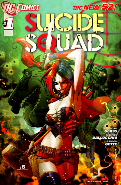 Suicide Squad #1 - A fellow member of Sketch Charlotte remarked about this cover on Facebook and my first thoughts were that someone saw all the cosplay girls dressing up as the Arkham Asylum version of Harley Quinn and wanted to see how far they would go. Harley's costume is entirely impractical but I'll agree that it needed reworking as when rendered in a naturalistic style, the original Bruce Timm costume doesn't translate well. When the Arkham version was sitting around and getting good fan response, why redesign it? The team consists of King Shark, an old Superboy villain from Hawaii, now apparently a hammerhead and Suicide Squad regular Deadshot, also redesigned, and you have a reprise of the team of villains that the government sends in because who cares if criminals die, and after all, why do we need to even worry about their civil rights? Seriously, the concept behind this title is one I stopped caring about somewhere around fifteen years ago, but that pretty much sums up my relationship with most superhero books.
To be continued….
Batgirl #1- Well Barbara Gordon is finally gonna be Batgirl again. Somehow she's gonna walk again and be jumping off of rooftops. In a world where Bruce Wayne was folded in half and got to walk again, it always seemed funny that Barbara Gordon's one shot to the spine kept her in a wheelchair. Gail Simone is writing, so it should be well-written, and it's always refreshing to see a female character written by a talented female writer. I don't care for the artist. It looks like Adam Hughes will be doing the covers, but with Adam Hughes on the outside, I don't feel good about the inside matching in aesthetic sensibility. That just pisses me off a little bit. It's books like this one is shaping up to be that I'm glad most shops let you flip through a book before buying it.
Justice League #1 - Geoff Johns and Jim Lee and this is the book that is setting the stage for the entire relaunch. There's not a lot to determine quality based on the solicitation. However, we do get to see a first look at the costumes where everybody gets collars, even Wonder Woman, whose costume doesn't have shoulders, gets a choker that looks like it'll injure her throat if she looks down. Green Lantern gets no redesign except for his collar, Flash gets some Lightning bolt elements. Superman's shield gets a major redesign, he gets a high collar, and the red trunks are gone. My opinion is that Superman doesn't look like Superman anymore but some guy that's pretending to be Superman. The biggest offense to me is Cyborg who looks like he was thrown in there to have a black guy on the team. I stand by my whitewashing comments and really think we'll see him thrown into the background. The Justice League doesn't need a scientist, they have Barry Allen. Gadgetry? You have Bruce Wayne. Technology? Superman has an entire Fortress filled with alien stuff from all over. Please excuse the rhetoric, but Cyborg is a super-token.
Suicide Squad #1 - A fellow member of Sketch Charlotte remarked about this cover on Facebook and my first thoughts were that someone saw all the cosplay girls dressing up as the Arkham Asylum version of Harley Quinn and wanted to see how far they would go. Harley's costume is entirely impractical but I'll agree that it needed reworking as when rendered in a naturalistic style, the original Bruce Timm costume doesn't translate well. When the Arkham version was sitting around and getting good fan response, why redesign it? The team consists of King Shark, an old Superboy villain from Hawaii, now apparently a hammerhead and Suicide Squad regular Deadshot, also redesigned, and you have a reprise of the team of villains that the government sends in because who cares if criminals die, and after all, why do we need to even worry about their civil rights? Seriously, the concept behind this title is one I stopped caring about somewhere around fifteen years ago, but that pretty much sums up my relationship with most superhero books.To be continued….
Saturday, June 11, 2011
First Thoughts on the DC Relaunch: Part One
Please keep in mind that any facts that I relate are not researched and may be completely wrong.
This September, DC Comics will relaunch all of its comics. Everything is cancelled including some comics that were really finding their legs, and some are relaunched with new number one issues as part of a 52 issue "relaunch," which includes new costumes for many DC Heroes, including Superman, designed by Jim Lee.
The concept of restarting all DC titles with new number one issues first was proposed following the Crisis on Infinite Earths, and has since been mentioned almost as a joke as sales figures reveal that number one issues sell better. The only DC monthlies that I have been reading have been Legion of Super-Heroes, Adventure Comics and Zatanna. I'm disappointed that Zatanna is leaving, and that the legacy of Adventure Comics is gone. The Legion will have two titles, including one that strands some of them in the 20th century, because we haven't seen that before. Now just explain why a team that has history at its fingertips and regularly travels through time can't just go back and get them as they regularly did for two of its members in the past.
My first thoughts on the costume redesigns are comprehensively, why redesign? When this is part of a massive PR event, the impact of the redesigning of Superman's costume is lessened. The other iconic redesigns are minimal and serve only to say that everyone was redesigned so Superman is no big deal. You'll see them in the covers I post here, and I apologize for any broken images or links, since there is no way I'm hosting copies of these images on my web site. I'm going to start with the stuff I'm actually looking forward to and then skip around, depending on the order I come across the cover images.
 Batwoman #1 - Well, It's about damn time. This title is almost a year past its original solicitation and surprisingly, I still care. I was a fan of Greg Rucka's stories in Detective Comics last year and I may very well end up regularly buying this series regularly. Rucka really reformed the characters reason for existing beyond simply to have a lesbian super-hero and transformed her into a fleshed out character whose sexual orientation has little to nothing to do with what she does or why she does it. My hope is that it's kept only loosely tied into the other Batman family books and given a chance to rise or fall on its own merits. J.H. Williams is a great artist and the fact that he's getting assistance on the writing gives me hope. As far as relaunch news goes, I'm actually pleased by this possibility

Legion of Super-Heroes #1- I'll buy this for certain, again, I'm a sucker for the Legion, and this promises to be a straight continuation of the currently running series. From the cover and the solicitation from DC, several of the Legion Academy students are admitted to the Legion to make up for the loss of the seven members lost in the 20th century. Dragonwing is shown on the cover, and her powers are flashy enough to be interesting. What other students make the cut remains to be seen. What's sad in the broad context is that this will be the seventh series titled Legion of Super-Heroes, and the sixth first issue for this title, and fourof those six first issues are in the past 20 years.
The artist for this series is slated to be Francis Portela, whose fill-in work has out-shown regular artist Yindray Cinar in my opinion. Portela doesn't skimp on backgrounds and has a great sense of anatomy and composition. His personal style is very fluid and organic with just enough cartoonish elements without being a caricature. I look forward to this one actually. That's more than can be said for some of the new series.
To be continued....
Monday, June 6, 2011
Nightcrawler

Okay, so Thursday night before HeroesCon and I’m just having trouble drawing anything right, so I flip through my sketchbook and see a drawing of Nightcrawler I’d done at Bridgit’s suggestion a few weeks ago. I really didn’t feel satisfied with it. I remembered back to a sketch I’d done for a three-year old boy of Spider-Man where he was hanging upside down. It was kinda inspired by the cover of Sensational She-Hulk #3 where John Byrne had Spidey guest star and on the cover had him hanging upside down. My sketch went pretty well, using the technique of drawing the character right side up and turning it over for any finishing elements. The smoke is a huge problem, as I really prefer the look given to it in the films, but I think it’s just a little too wispy. However, when it’s drawn in the comics, it overpowers the panels at times.
So there we have a Nightcrawler that I can live with. Now, because Bridgit likes Nightcrawler so much, and I drew this on a sheet of letter-size Bristol, I’m giving the original art to her. I’ve got a hi-res scan that I’m gonna use to color it. I do that from time to time, giving drawings to friends.
Examiner coverage

For three days in a row, my coverage of HeroesCon 2011 has made not just the front page of examiner.com's Charlotte site, but the first tab. This has given me a lot of page views which I hope translate into some people coming back to check me out.
All is not rosy there, though. My first article, posted on Saturday, was deemed by examiner.com's review team to not be of local interest, despite me referencing a local news anchor in it, as well as the owner of a Charlotte comics store that I've written a lot about. Now, there's an appeals process that I'm in the middle of, and everything should work out, but all the same, it cheesed me off mighty big.
Tuesday, May 31, 2011
I got scolded because I wasn't local enough.
Since January, I've been writing local comic book articles for examiner.com's Charlotte site. Today I got my first scolding for my article I posted Sunday, DC is whitewashing itself. It wasn't removed, I wasn't "fired", and by no means am I going to quit writing for them. However, I am going to vent a little.
The article is a good one, in my opinion, however not my best. One of the things I've noticed in the few months that I've done this is that the quality of an article does not always get noticed broadly. One article that I wrote, Illegally downloading comics hurts local shops, not publishers, is one of my least viewed articles, and has no reason to be. It's a damn fine article.
The way examiner.com and other web sites like to pay columnists, including me is based on page views, not by the word or article. This puts me at the mercy of my biggest referrers, namely the comic shops that I write about. If I were to care specifically about that, I'd be wary of writing articles critical of them and in another article, Reviews need to support the Charlotte comics community, that I shouldn't try to be overly critical just for the sake of being critical, and since writing that, I've made it my position that I just won't talk about the bad, when it comes to local shops. If you don't see a local store mentioned much in articles I write, it's because, quite simply, I don't have anything good to say about them. Only one shop meets that criteria, by the way, another I just haven't had the time to highlight. But I digress.
I contacted a creator for comments on something negative about the industry, and was told that he didn't want to comment, for fear of biting the hand that feeds him. Well, as a journalist, albeit a very inexperienced one with limited coverage, I cannot do that. Honesty may not always be the best policy, but withholding honesty when something is just going wrong, or when criticism can effect positive change is just playing it safe and no one did their best by playing it safe.
Case in point, an interview with Barbara Kesel revealed that her career started with her being critical of DC Comics' treatment towards female characters and her constructive criticism has continued within an industry that continues to pander towards a fan base that is predominantly white, male and aging more and more. She is still openly critical of her industry, but does so constructively. That's my job when I have to be critical and how I ended my article about the role of minorities diminishing at DC:
That's my promise to myself when writing these articles, that I will, whenever I have to be critical will urge actions by comics fans, creators, and business owners in how to move forward to remedy the situation in question.
The article is a good one, in my opinion, however not my best. One of the things I've noticed in the few months that I've done this is that the quality of an article does not always get noticed broadly. One article that I wrote, Illegally downloading comics hurts local shops, not publishers, is one of my least viewed articles, and has no reason to be. It's a damn fine article.
The way examiner.com and other web sites like to pay columnists, including me is based on page views, not by the word or article. This puts me at the mercy of my biggest referrers, namely the comic shops that I write about. If I were to care specifically about that, I'd be wary of writing articles critical of them and in another article, Reviews need to support the Charlotte comics community, that I shouldn't try to be overly critical just for the sake of being critical, and since writing that, I've made it my position that I just won't talk about the bad, when it comes to local shops. If you don't see a local store mentioned much in articles I write, it's because, quite simply, I don't have anything good to say about them. Only one shop meets that criteria, by the way, another I just haven't had the time to highlight. But I digress.
I contacted a creator for comments on something negative about the industry, and was told that he didn't want to comment, for fear of biting the hand that feeds him. Well, as a journalist, albeit a very inexperienced one with limited coverage, I cannot do that. Honesty may not always be the best policy, but withholding honesty when something is just going wrong, or when criticism can effect positive change is just playing it safe and no one did their best by playing it safe.
Case in point, an interview with Barbara Kesel revealed that her career started with her being critical of DC Comics' treatment towards female characters and her constructive criticism has continued within an industry that continues to pander towards a fan base that is predominantly white, male and aging more and more. She is still openly critical of her industry, but does so constructively. That's my job when I have to be critical and how I ended my article about the role of minorities diminishing at DC:
So when talking to writers at conventions, especially HeroesCon, ask them about diversity in comic characters and ask them why the heroes in comic books don't look more like the rest of the country?
Continue reading on Examiner.com
That's my promise to myself when writing these articles, that I will, whenever I have to be critical will urge actions by comics fans, creators, and business owners in how to move forward to remedy the situation in question.
Friday, May 6, 2011
Free Comic Book Day

If you're near Greenville, please come and say hi! I actually look to meet a lot of new people and just enjoy a day of drawing in a great comic book environment! If you're in Charlotte, go by Heroes Aren't Hard to Find, where there will be a ton of great talent in the store.
Wednesday, April 27, 2011
04/28/2011

Sunday, March 20, 2011
03/21/2011

Subscribe to:
Posts (Atom)